Interior Home Designers Will be Drawing Inspiration from Your Personality in 2017
TOCON Pro Painters
Calgary Interior Exterior High Quality Painting Contractor
It's now 2017, which means one thing: It's time to discuss which home decor trends will define the year.
 On the color front, sophisticated hues are poised to take center stage, according to Behr,
which has predictions for colors to keep an eye on in 2017. The paint
company has divided its selections into three palettes — Confident,
Composed, and Comfortable — and if they are any indication, we'll be
drawing decor inspiration from our personalities in the year ahead.
On the color front, sophisticated hues are poised to take center stage, according to Behr,
which has predictions for colors to keep an eye on in 2017. The paint
company has divided its selections into three palettes — Confident,
Composed, and Comfortable — and if they are any indication, we'll be
drawing decor inspiration from our personalities in the year ahead.
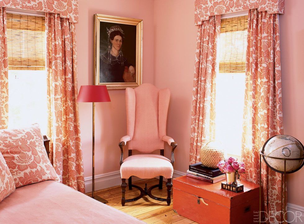
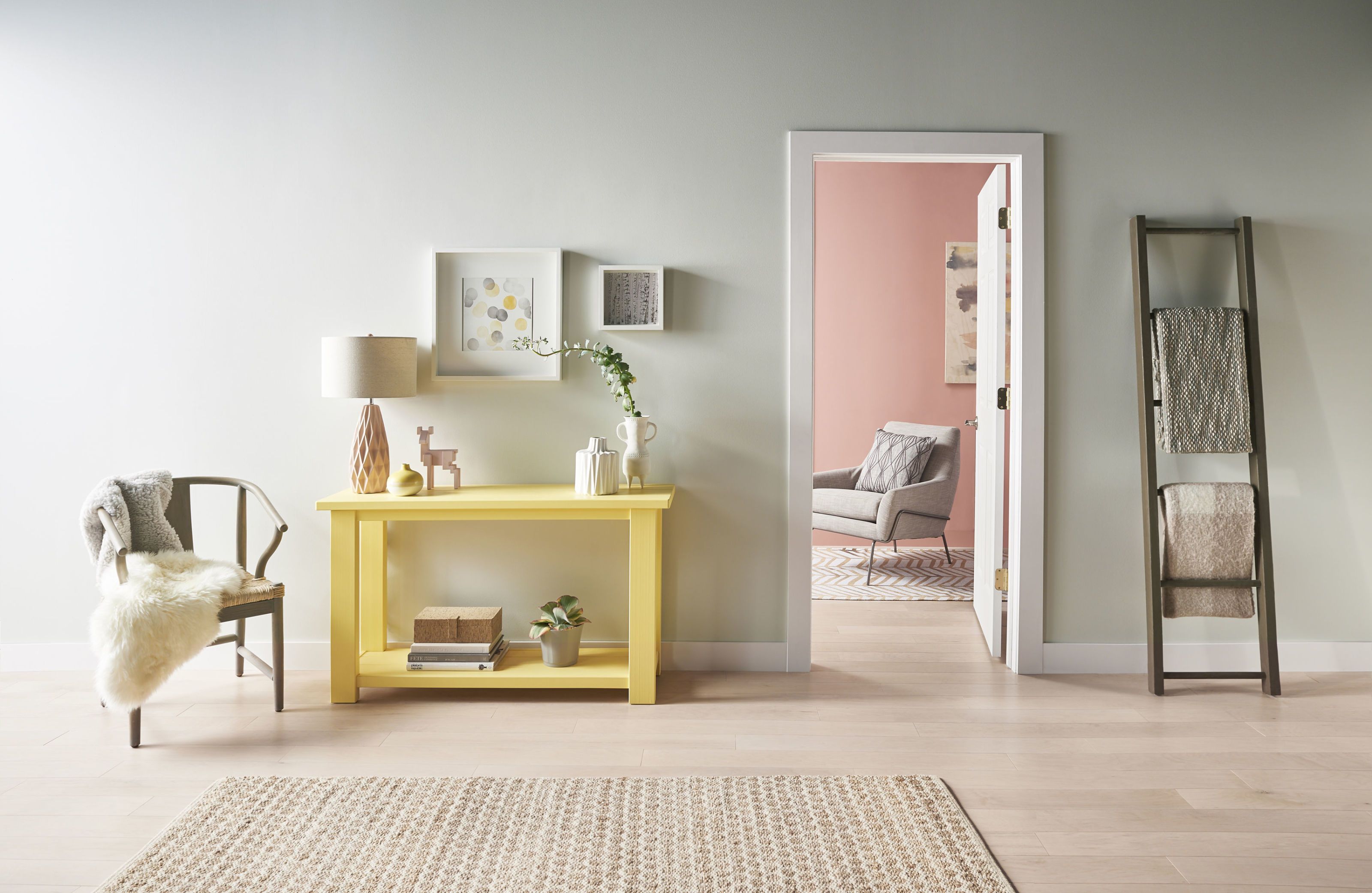
Creative, social types will be drawn to the Confident palette, defined by dusky blues, spicy reds, and lime greens, designed to captivate your attention. Then there's the Composed palette. Its earthy greens and taupes will be a go-to for traditionalists looking to create a contemporary space. And it's all about pale pastels in the Comfortable range, characterized by light pinks, blues, and yellows that make the smallest of spaces pop. Its muted shades are ideal for introverts who want to make their first foray into accent colors.
We've already seen some of these shades make waves this year, so if you need some help imagining how they might play out in your own space, look no further than 9 rooms below. It's easy to see why we'll be obsessed with them well into 2017.

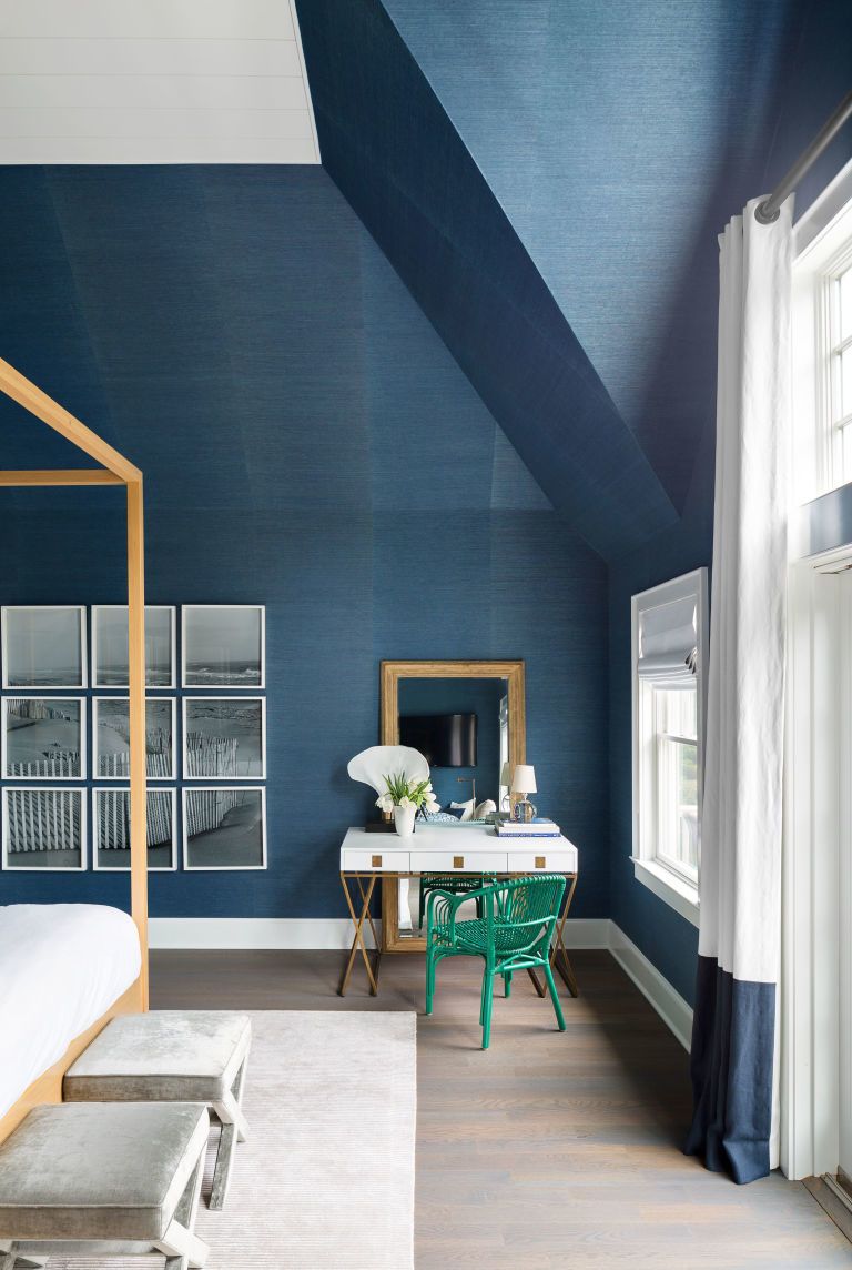
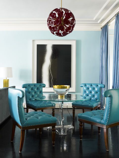
This Hamptons home
proves that feeling blue doesn't have to be a bad thing. Intended to
recall the colors of the ocean, the beachy shade used here highlights
the home's high ceilings.
Similar to shown: Endless Sea by Sherwin-Williams
 Orange accents pack a punch in a saturated green space. It's the perfect color combo for when you want to up the drama.
Similar to shown: Endless Sea by Sherwin-Williams
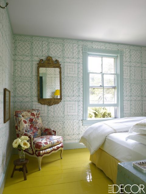
Yes, painting your floor lemon yellow is a risk – but don't you feel happier just looking at this room?
Similar to shown: Fiesta Yellow by Benjamin Moore
Similar to shown: Fiesta Yellow by Benjamin Moore
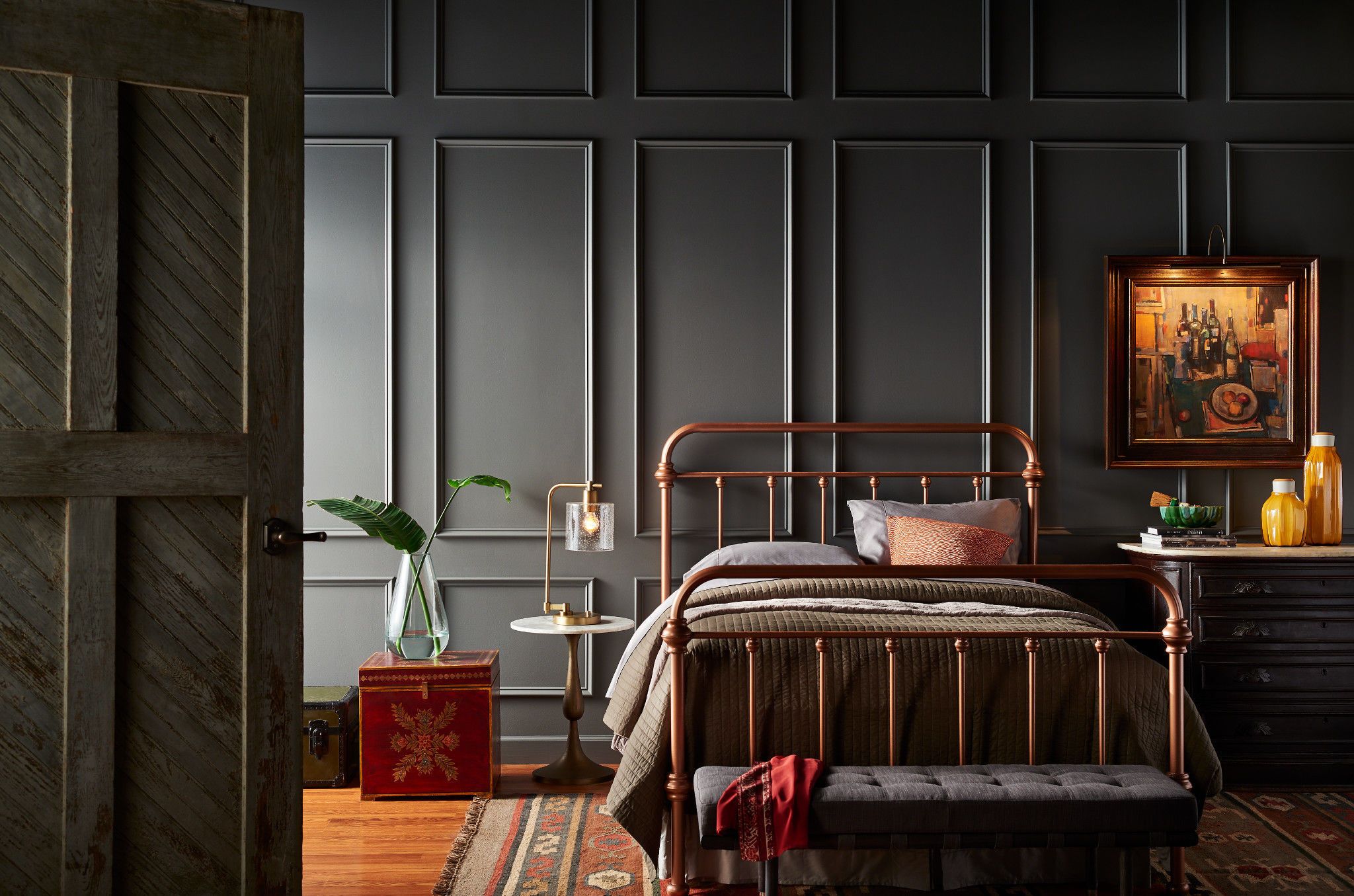
The best way to kick traditional
style up a notch? Paint your space a rich color like this dark gray. In
this case, the texture of the wall softens the solemn shade.
Get the look: Shades On by Beh
Get the look: Shades On by Beh
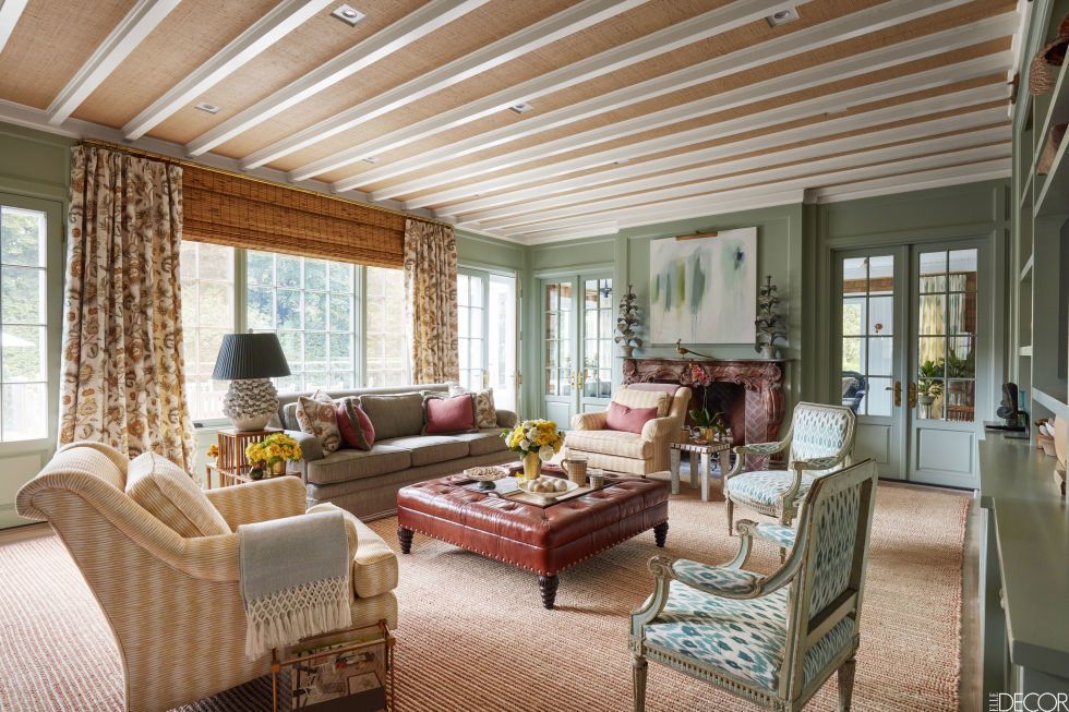
Taupe and earthy green create a calming vibe in an East Hampton summer home.
Similar to shown: Strong Neutral Tone by Farrow & Ball and Feathery Blue by Farrow & Ball
Similar to shown: Strong Neutral Tone by Farrow & Ball and Feathery Blue by Farrow & Ball
TOCON Pro Painters

No comments:
Post a Comment